Helen Huang
Visualizing Government Debt
Data for the visualizations comes from OCED.org.
I used the dataset provided on canvas for part 2 and part 3.
Part 1

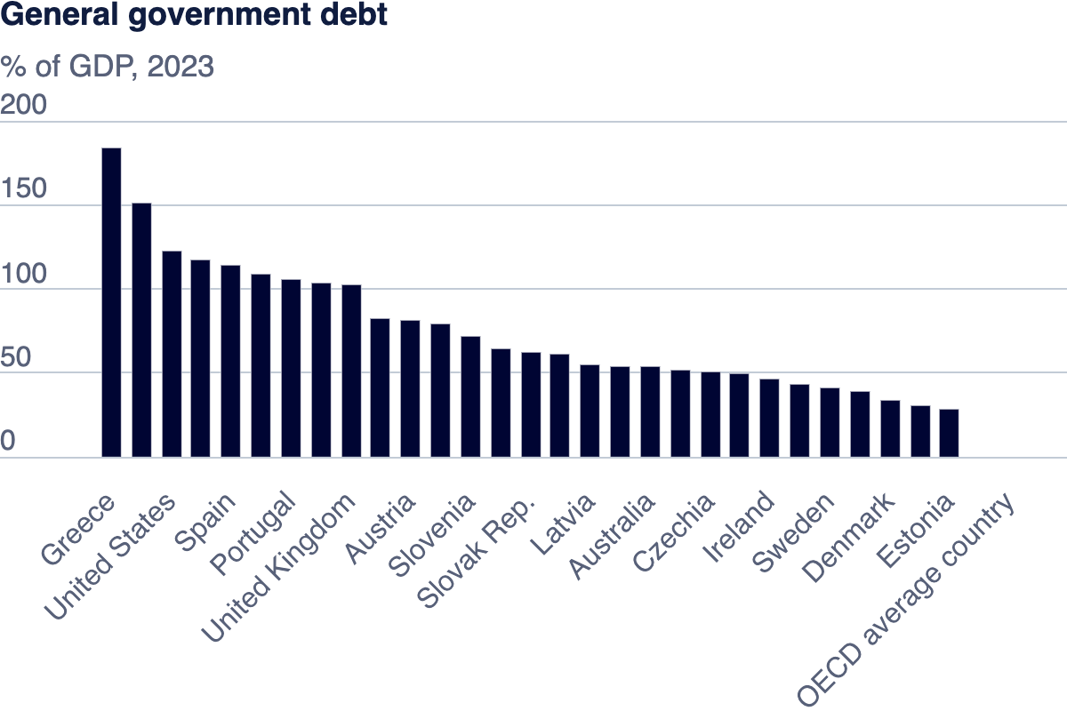
This visualization shows the general government debt for different countries in the year of 2023, where the y-axis is debt in the percentage of GDP.
Part 2
This visualization is a heat map showing the countries with the most debt over the years. The data is from the Canvas page.
Part 3
For the visualization above, I wanted to see what the debt of the richest few countries are like. I chose the top five richest country in the dataset, and presented the data with a line graph. The legend is color coded such that the darker the color, the richer the country is according to their GDP per capita. The data is from the Canvas page.
I found it interesting that the richest country (Luxemborg) have a very low and stable government debt over the year. However, countries like Ireland and US have big fluctuation, and at times, their debt are even more than the GDP per capita.
I think the two visualization are different in that, one is very comprehensive with its data (viz 2 shows all countries and all the years), while the other one is much more concise. The two visualization also focuses on completely different things. Viz 2 puts an emphasis on countries with the most % of debt, while viz 3 focuses on the countries that are overall richer. Both shows that some countries have more debt than the other, but tells different stories.